Cereal Magazine
-
42nd Annual Student Exhibition
Oklahoma State University
April 2023
CEREAL magazine is a modern and minimalistic publication that features travel, style, and art. The goal of this redesign was to elevate the existing brand by making it more unique and inspired while staying true to the contemporary nature of the magazine.
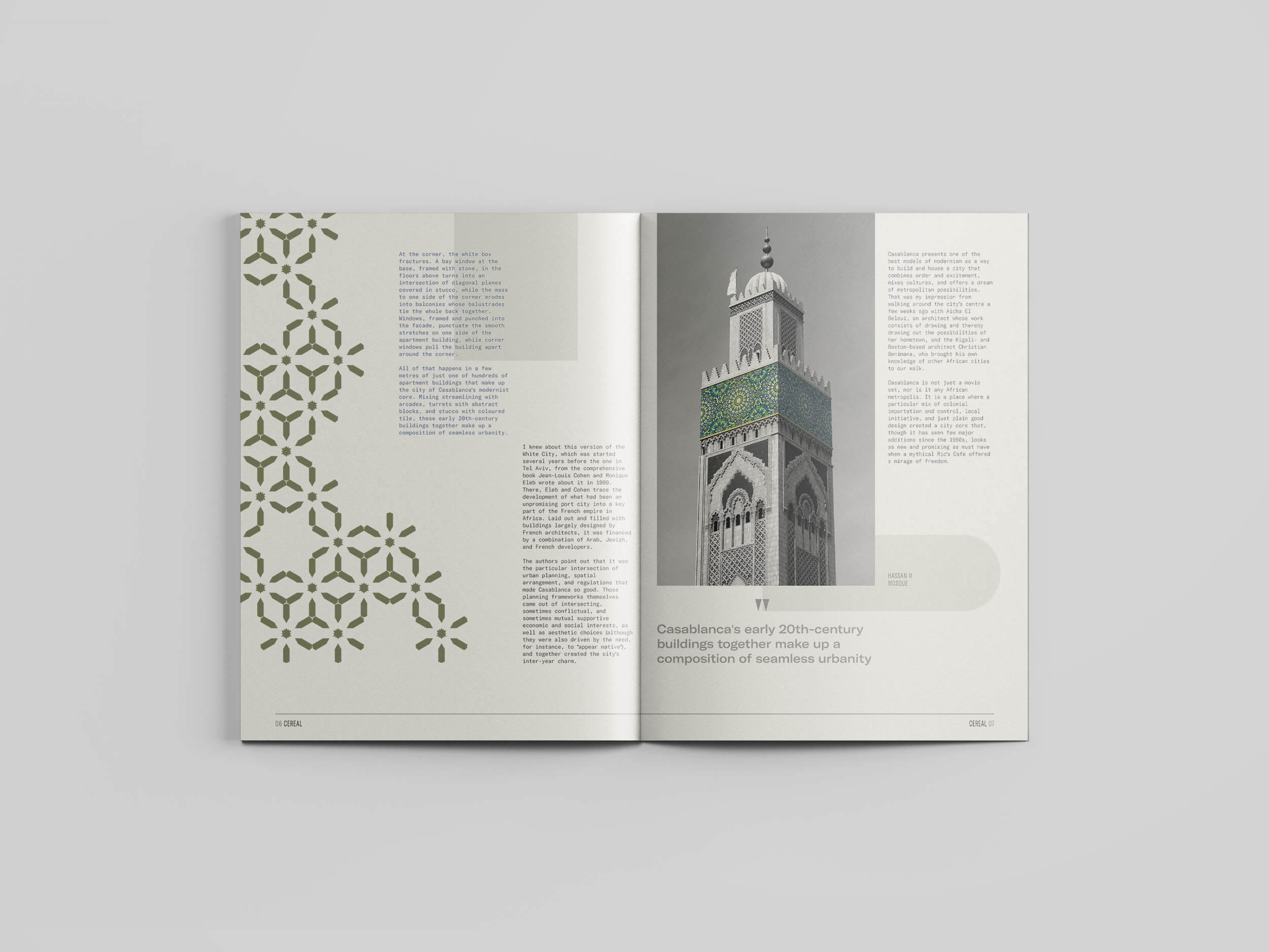
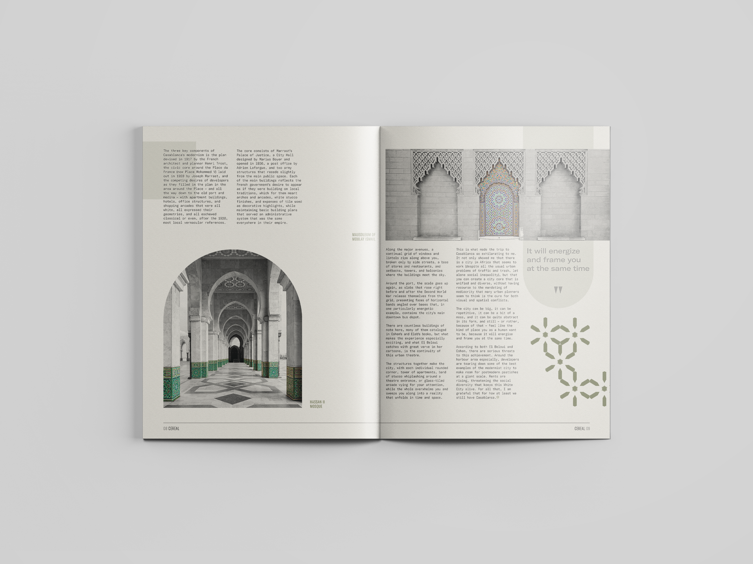
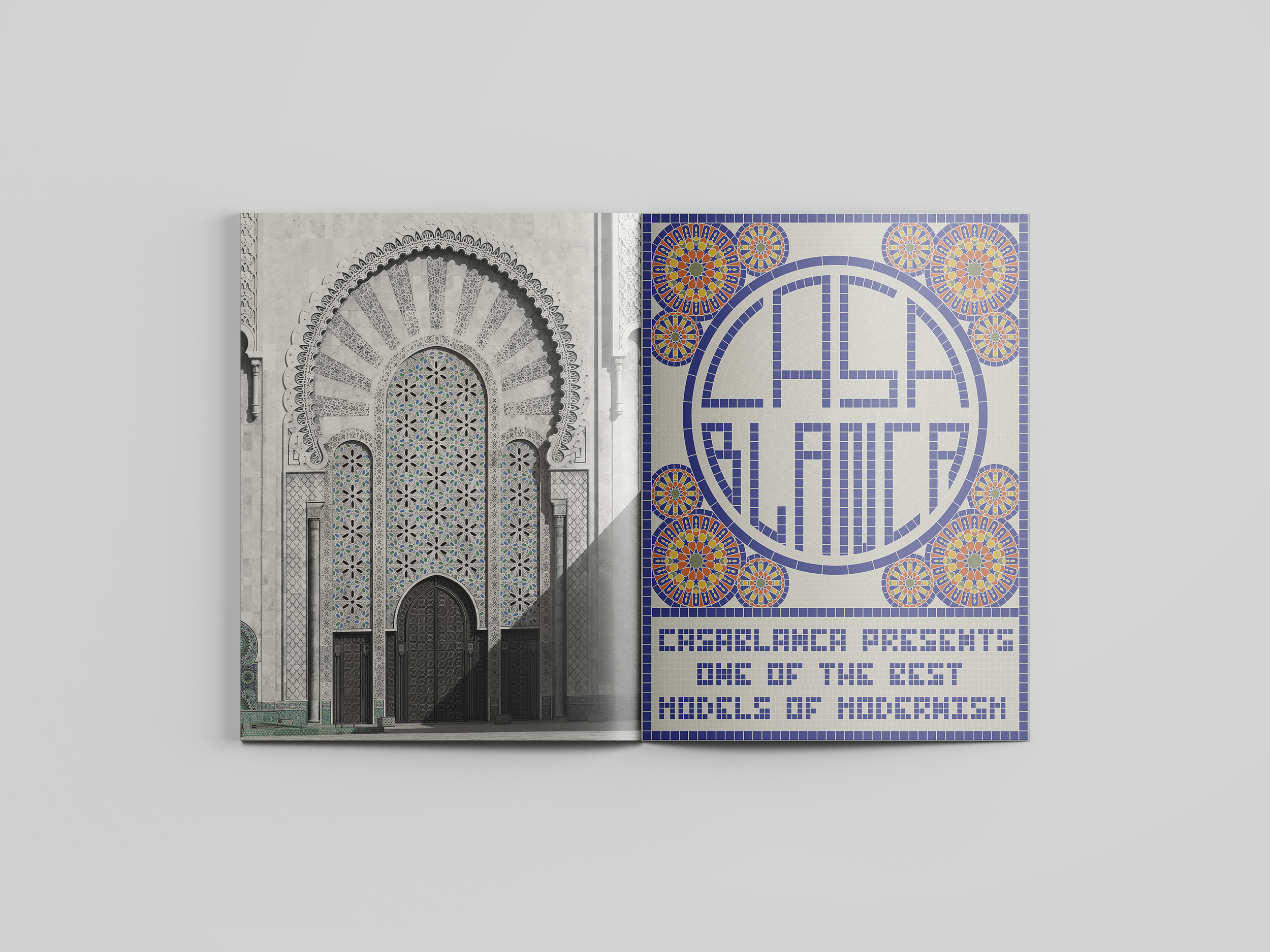
The design approach was to create an elegant balance of image, type, and color. Image and type compliment and reflect each other, as seen in the feature spread. Small pops of color in each image help bring them to life and draw attention to the patterns within the architecture while still feeling refined and sophisticated. Design elements are drawn directly from the images themselves, such as the “flower” pattern spreading across the the feature spreads; blurring a line between the forms of natural elements and manmade structures. The masthead was chosen for its simplicity and elegance while still being clever by connecting the crossbars of the ‘R’ and ‘A’ for the ‘Es.’
Deliverables:
Masthead
Spreads (x3)
Table of contents
Covers (x2)