In-N-Out Rebrand
-
FLUX 2022 Design Competition
AIGA Baltimore
February 2023
In-N-Out has been California’s most beloved and iconic fast-food chain since its inception in 1948, but their current branding doesn’t make it seem that way. This rebrand aims to reflect California’s exceptionally fun and vibrant culture to better connect with their audience while still respecting and acknowledging the brands’ past – and future.
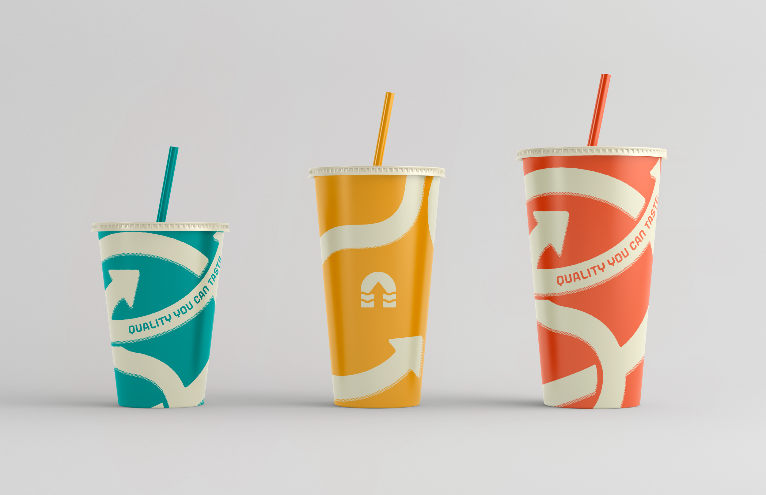
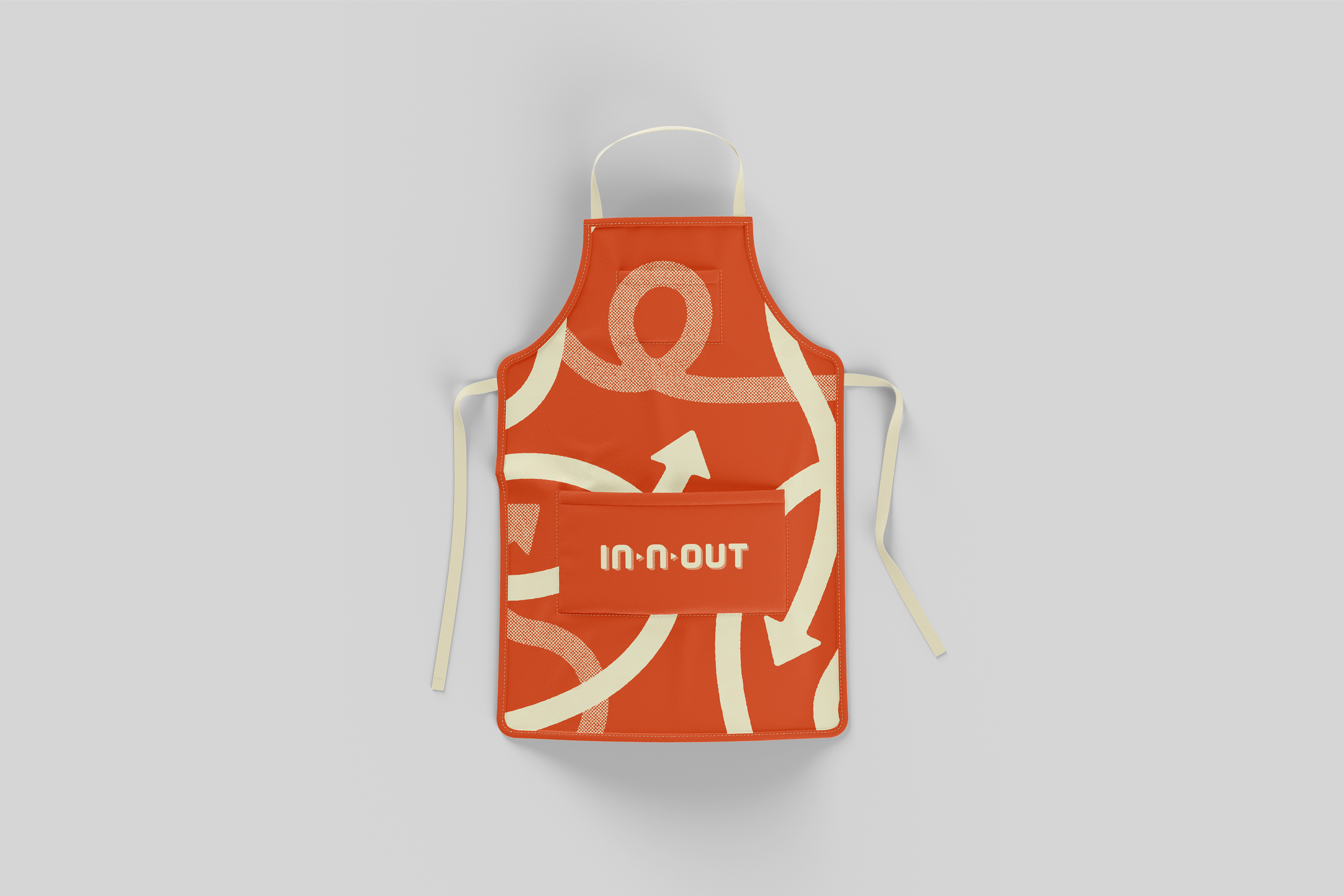
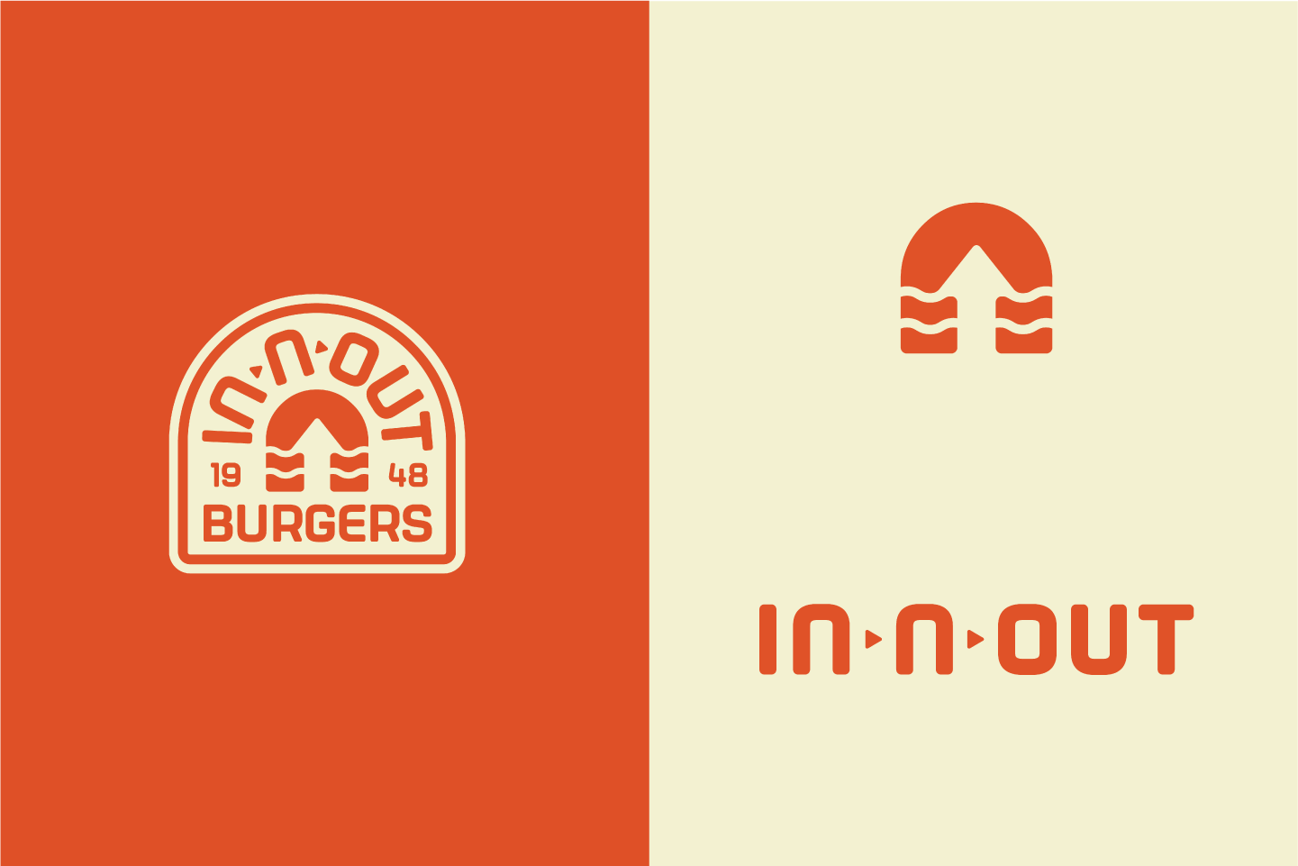
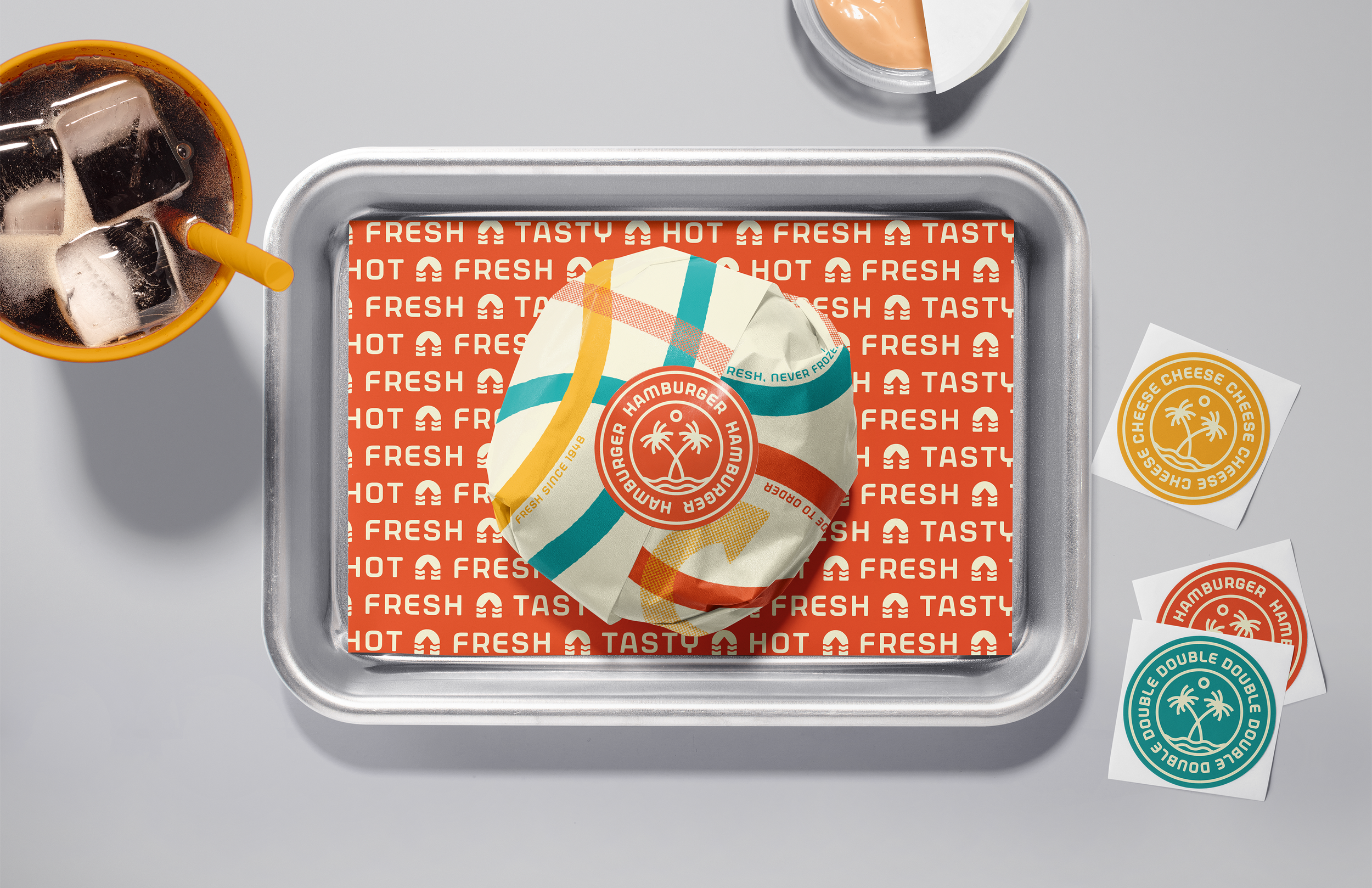
The arrow, the long-standing symbol of the brand represents the companionship and connection of In-N-Out employees: “We all work under the same arrow.” I took the arrow, incorporated it into a letterform, and changed it from an arrow pointing down to one pointing up. This symbolizes that brand is moving onward and upward, into the future. The two wavy lines that dissect the letterform are reminiscent of waves on the beach, as California’s surf and skate culture helped make the once-unknown In-N-Out a staple. Whether they shredded the waves or the rails, they always ordered a specific burger: mustard-grilled, with extra spread and grilled onions. This burger was dubbed “Animal Style” by the employees, and it’s become In-N-Out’s most iconic order.
The wavy lines of the logo are incorporated into the other brand elements to maintain cohesive branding. The wrapper, cups, stickers, and employee uniform feature wavy arrows weaving in and out, always pointing up. These arrows are roughened around the edges and occasionally given a halftone, a nod to the printing quality and techniques of the 1950s in which In-N-Out grew to prominence.
Deliverables:
Logo, alternative logo, + icon
Burger wrapper + stickers (3)
Cups (3)
Employee uniform (shirt + apron)